The Traveller App - Research Study

Solution: The traveller app empowers travellers with up-to-date information about travel prices and COVID-19 protocols that enable them to plan safe, hassle-free, and clutter-free trips using its budget-tracker and checklist feature.
Problem: Budget conscious and busy people need an organized digital system to efficiently accomplish all travel plans and budgets because they need more time to enjoy their family travel experience than stress over the planning process.
Team members: Carol Burillo, Isabela Villanoy
Tools: Figma, Miro, Google Drive, Google Suite
Role/s: UX Researcher, UX Designer, UX Content Designer
Discovery
Interview Plan
The team used a semi-structured interview plan to gather qualitative research. Questions were prepared beforehand to ensure research objectives are met and research questions are answered. By having a semi-structured interview, we hoped to set a conversational tone that will illicit authentic and natural responses from interviewees and make space for improvisation when the need arises to ask the “why” for further clarification and explanation.
Online Survey
A Google Survey was conducted to create more primary research data. By doing so, our team was able to access a larger audience by disseminating it within our own personal social media platforms. Doing so allowed us to have a new perspective of the traveller and build on the data with our insights from the 1:1 interviews.
A total of 28 people participated in our survey.


Primary Research
The survey presents how 32.1% of people plan trips with a budget, however, 35.7% remain neutral in sticking to a budget throughout the entire trip. This data aligns with the respondents’ common likes when travelling: new experiences, adventure, and sight-seeing -- all of which are rooted in creating intangible and memorable memories.
Primary Research
User Interview and Survey Synthesis
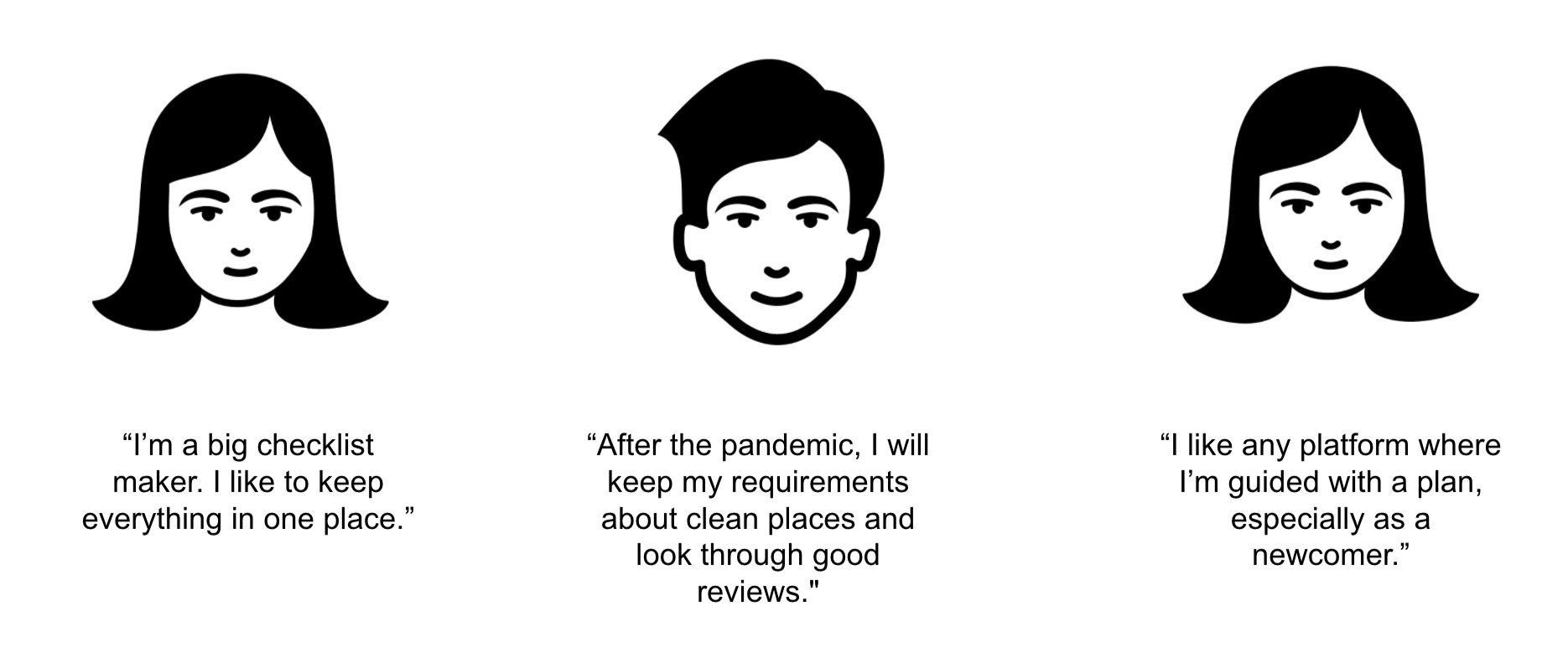
users like to have a checklist when preparing for a trip
users feel satisfied when their travel plans are well-organized
users want to be informed about the essentials when travelling (COVID protocols, sanitation practices of accommodations, etc.)
users are tech-savvy and keep digital records when travelling
users love travelling with family
providing transparency on accommodation and airline cleanliness ratings may ease the discomfort most people feel when travelling during the pandemic.
users have very specific wants when travelling; therefore, an app that recommends destinations based on a person’s previous travel experience may help them
Secondary Research
Secondary research was conducted to see the current travelling patterns of individuals and families during the pandemic.
90% of Bebe Voyage’s survey respondents, mostly families, are looking for flexible bookings
30.8% of outbound travels consist of families
35% of millennial respondents in GetYourGuide’s survey are planning trips abroad
Ideation
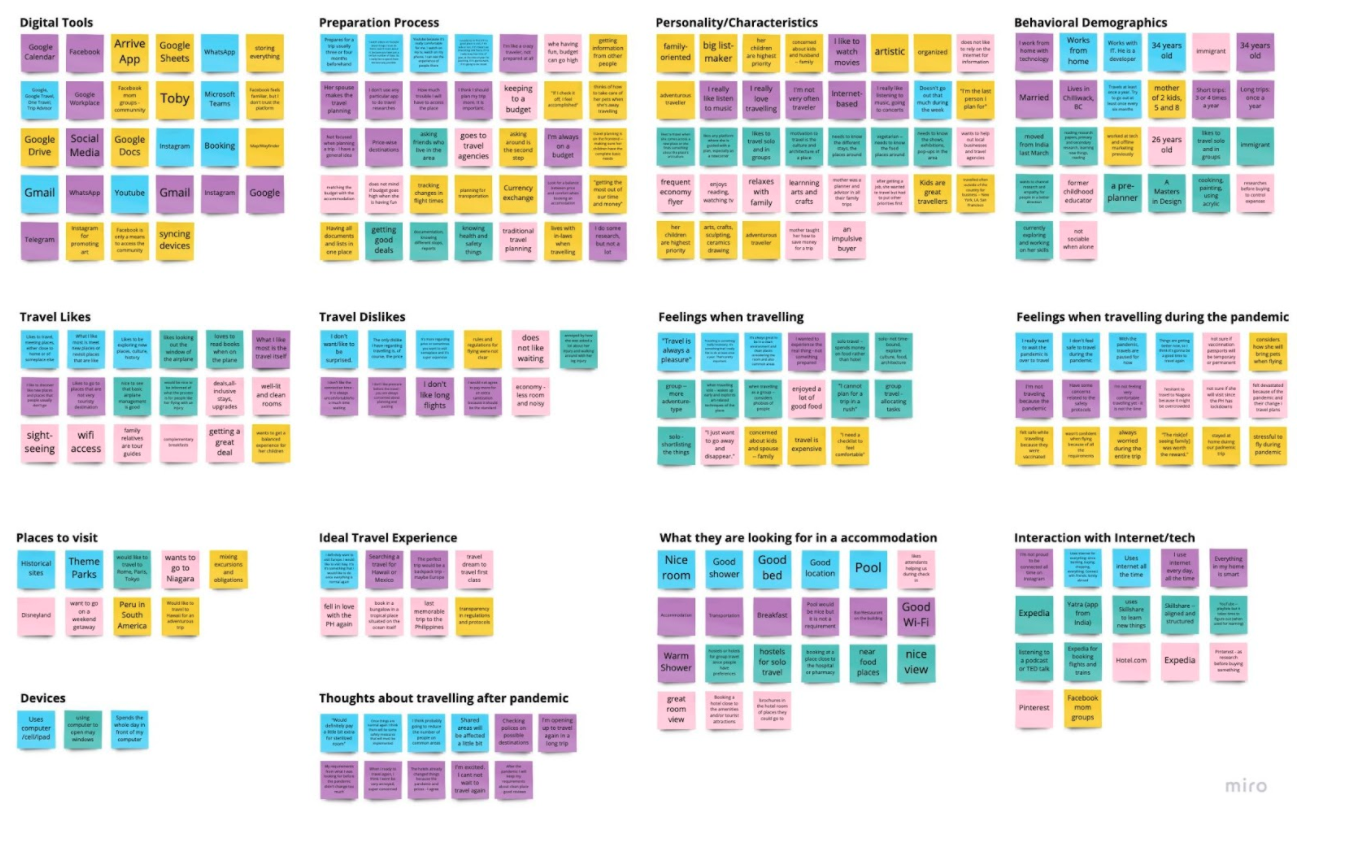
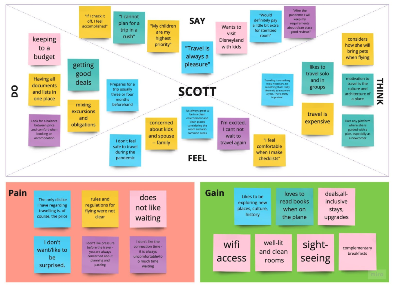
What do you like about travelling?
“Everything - planning, preparing, and the actual travelling. I like learning about new places and immersing myself in different cultures. I like how it reminds me that there's no one way to do things. I also really enjoy hanging out at airports and sitting in a plane for hours and thinking about the things we'll do when we land.”
What do you dislike about travelling?
“All the research and logistical gymnastics you have to do in planning”
“Flight Delay/cancellation, Long wait times, bad customer service, no early check in/out”
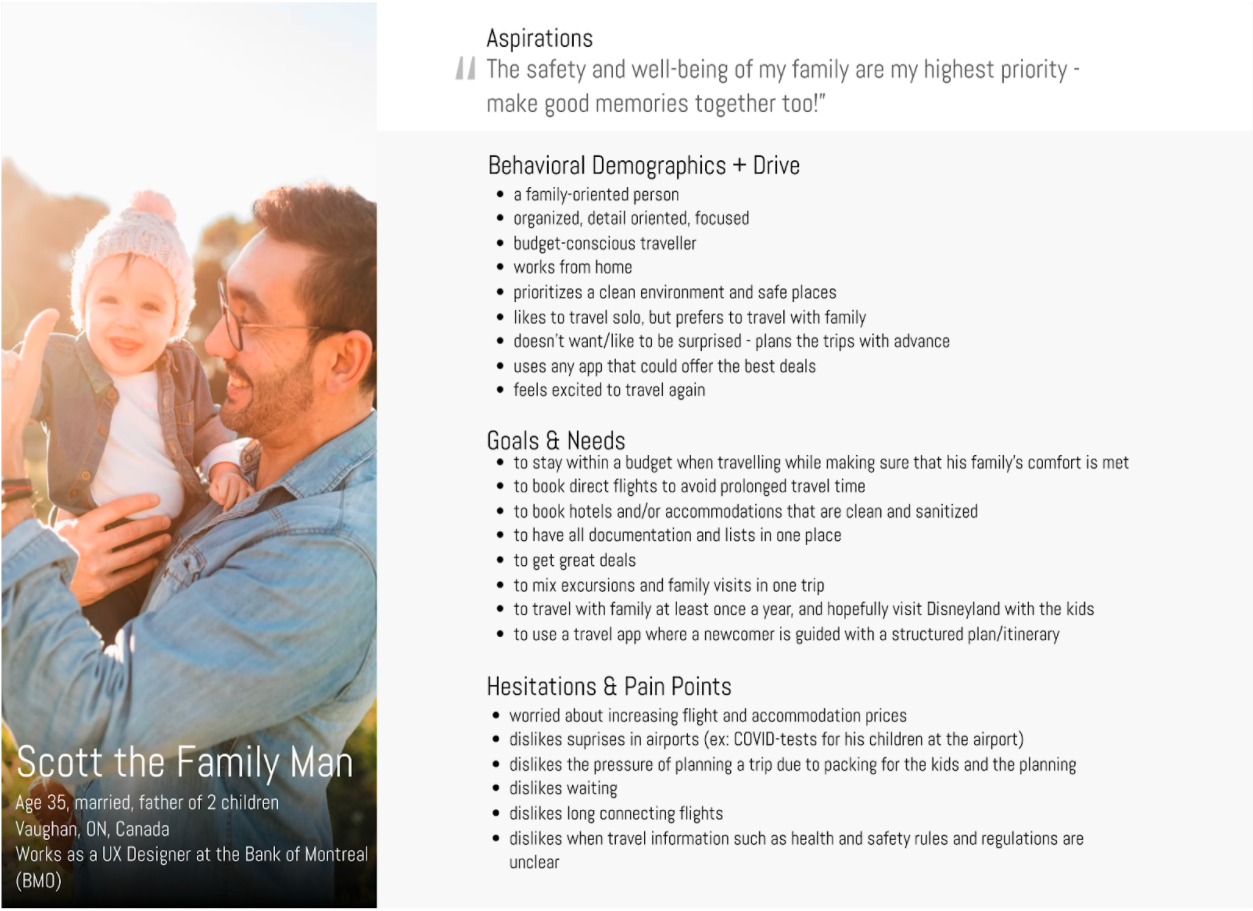
User Persona
Competitor Analysis
For the competitor analysis, I looked at the current online travel landscape via Expedia, TripAdvisor, WestJet, and Booking.com. These are online apps/websites that came up during our user interviews and surveys.
Based on the competitor analysis matrix, most of my competitors did not have a budget tracker feature. Having said that, this becomes the primary feature of my travel app.
To read a more in-depth analysis, click here.
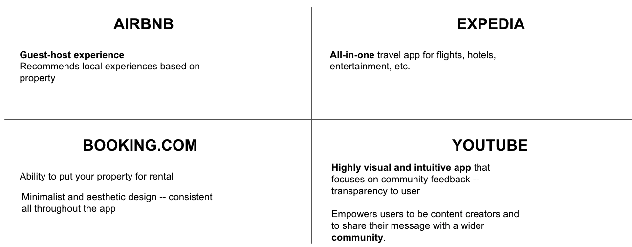
SWOT Analysis (Summary)
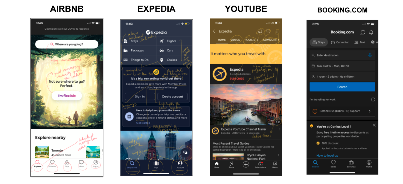
Competitor Analysis UI Annotations
User Journey Storyboard and Mapping
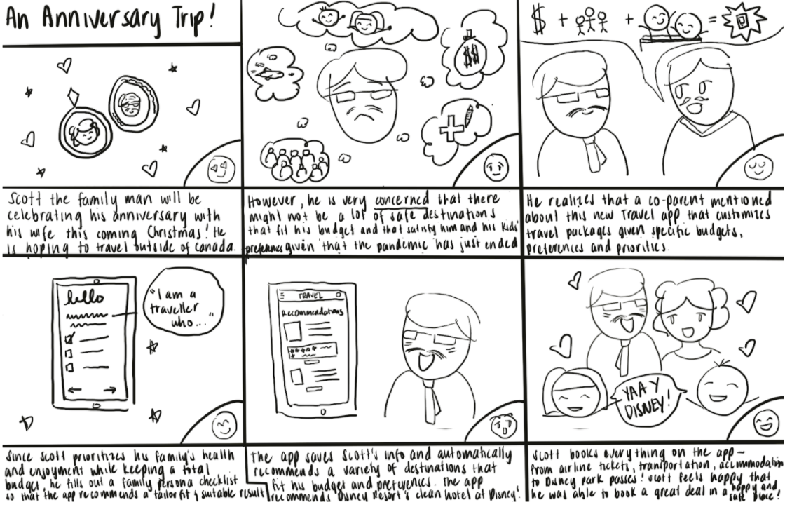
UX Storyboard
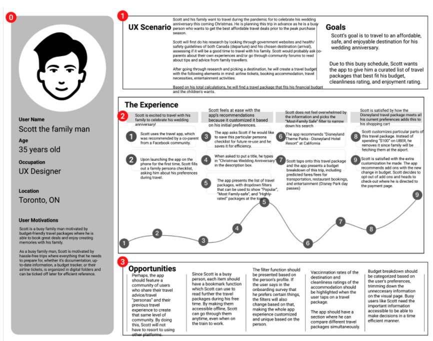
User Journey Map
Low-Fidelity Wireframes
The traveller app has 3 main features: booking packages specialized for the user, creating checklists, and managing budgets for flexibility.
The language of the product is designed to center the use throughout the journey, bridging the gap between the user and the digital aspect of the product. The app’s language is conversational and professional.
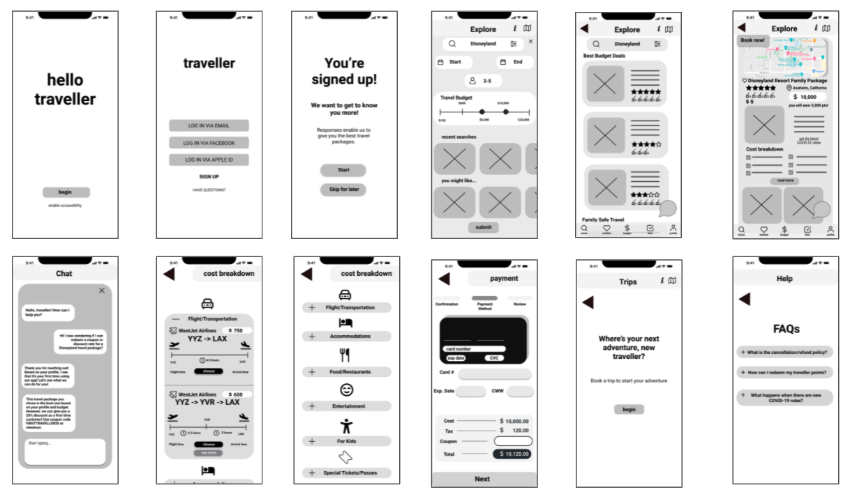
Main Content and Design highlights: Human-centered design in the language and microcopy of the app and a minimalist design that utilizes the white space/gutters of a page
Content and Content Design
By calling the user a “traveller” throughout the user journey, I am able to do two things: emphasize the brand’s theme and humanize the whole planning and booking experience within the digital product.
Sentences are short and casual in tone but professional in their intent.
Usability Test Results
Tasks:
To successfully complete the onboarding journey
To sign up
To purchase a travel package
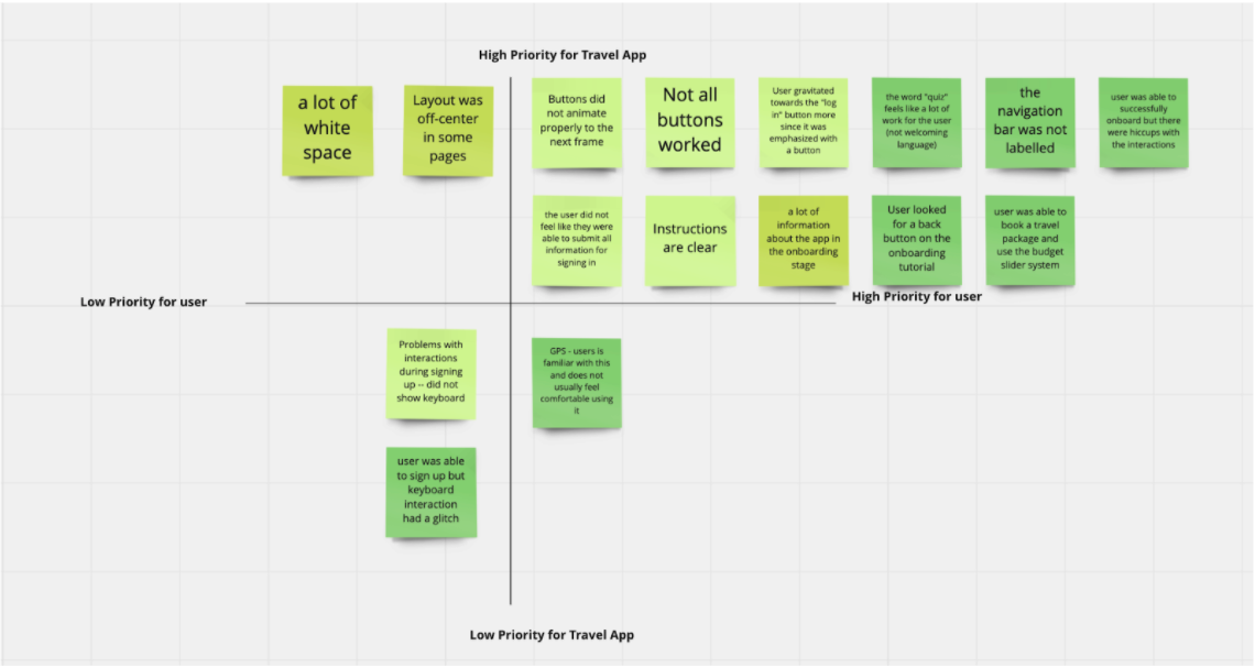
Prioritization Matrix of Pain Points
Final Thoughts
Create a high fidelity prototype in the future and test a new batch of users to see if they will have a similar experience with that of the low fidelity prototype
Make the sliders more interactive and flexible with a high fidelity prototype
Improve the interactions amongst pages to create a seamless user experience, whether it is low or high fidelity
Prioritize the tasks that are difficult -- the user flow was the most challenging
This project was in fulfilment of the requirements of the UX/UI Boot Camp at the University of Toronto’s School of Continuing Studies
The research phase of this project was initially done in pairs. After which, the project was completed individually.
References:
All pictures are copyright free from unsplash.com
Icons are all copyright free from uxwing.com
https://eglobaltravelmedia.com.au/family-travel-to-increase-by-25-by-2022-says-globaldata/
https://www.cnbc.com/2021/05/23/covid-travel-rising-airfares-and-hotel-rates-are-making-vacations-more-expensive.htmlhttps://travel.gc.ca/travel-covid/travel-restrictions/covid-vaccinated-travellers-entering-canada#children)https://www.nytimes.com/2021/03/30/travel/children-family-vaccines.htmlhttps://www.travelpulse.com/news/features/how-gen-z-millennials-gen-x-are-approaching-post-pandemic-travel.html
https://skift.com/2021/09/22/travel-agent-interest-surge-expected-in-post-pandemic-family-travel/